Events Local
About
After a new name and refocusing on providing event organizers with a suite of tools to make their jobs easier, Events Local needed an updated logo and improved UI. However, they also wanted to keep the same look and feel users had come to know and expect.
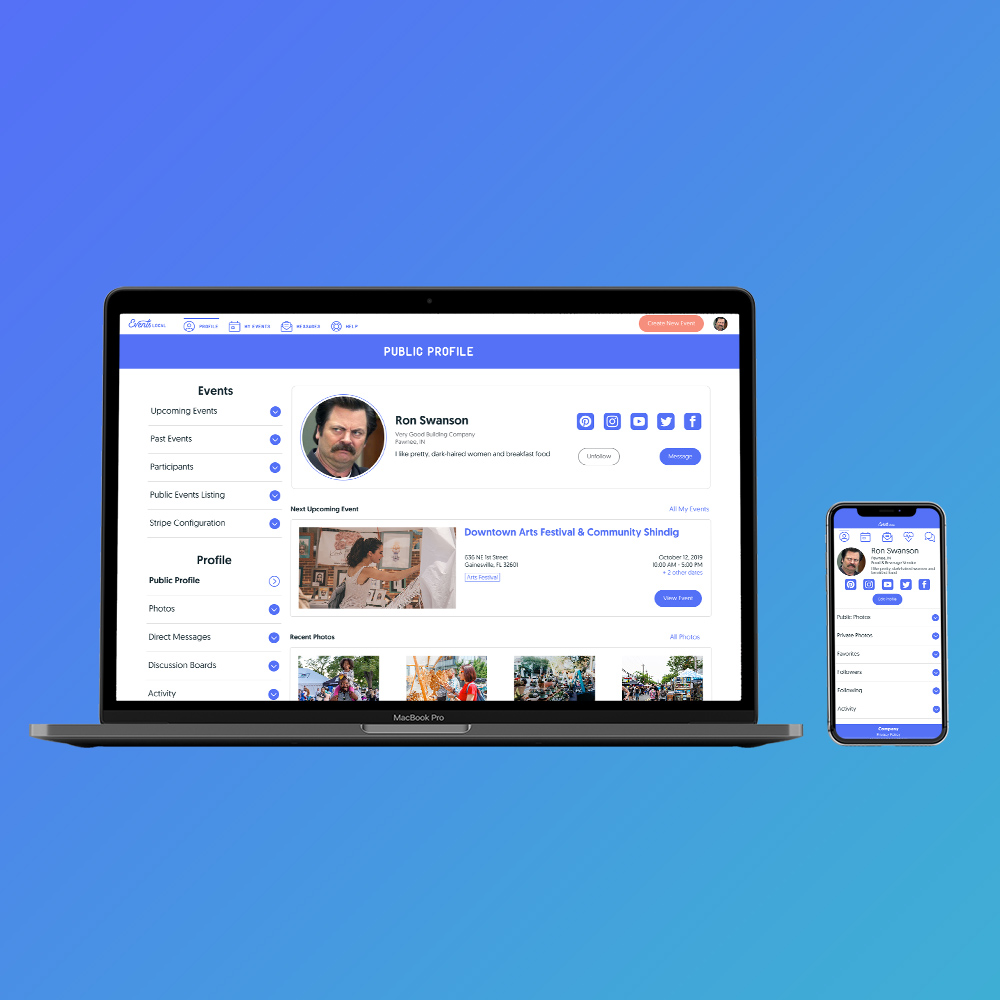
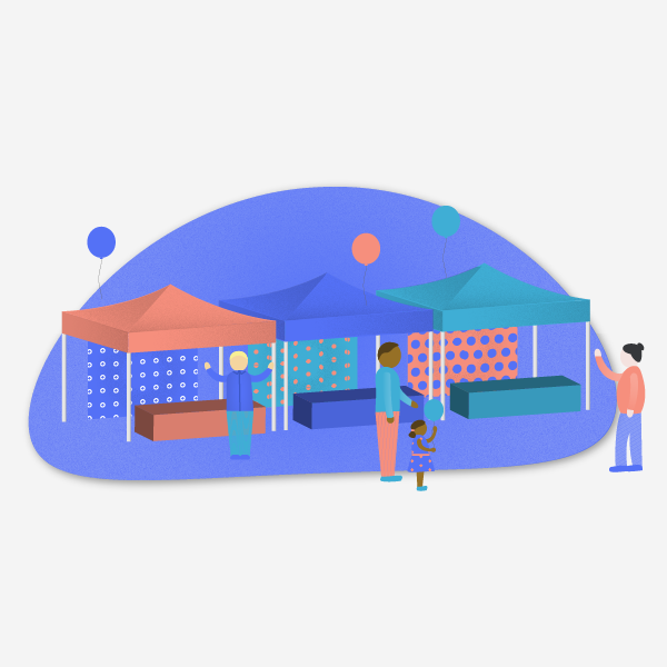
The new logo used the same typeface, but was modified to allude to their "everything under one roof" value proposition. The platform's UI was simplified based on user priorities. The color scheme was also simplified, with a primary color indicating interactive elements and two accent colors drawing attention to important functions and information. I also created illustrations for marketing and collateral and an overview video.


